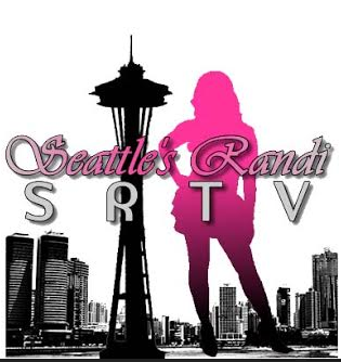
Final Seattle’s Randi Logo

Final-Logo

Final Logo

For my final logo I didn’t do very much to change it from the draft, mainly because the input I received from my classmates was so positive… or because I didn’t receive any input from them at all. Before I said I was going to try and throw in a background effect to the logo but I decided not to. I figured if I added one in it would make my logo stand out too much on a plain business card, or if I were to put it in front of a photo there would be a huge unnecessary yellow blob on the photo… which might be distracting.

To complete my final logo all I did was add in the space needle like I mentioned I going to do earlier. To make my space needle silhouette I used the same technique that I did for the silhouette of my body. It was a bit more difficult doing it on the space needle because there are a lot of spaces in the needle vs. one flat body tracing. The issue that I ran into was needing to move onto the next shape but not being able to get the pen tool to release the shape so I could. I figured out how to do it by clicking the selection tool and clicking back to the pen tool. It kind of worked as a reset, which was cool with me.

To me my logo represents much more than me standing with a camera. The camera in the photo is what I use for all of my video and photo work that I do. I chose to use the now playing look of my logo because not only do I do production work I also do work in front of the camera, hence the entire point of this website. My logo represents me working behind the camera doing production work but also represents me as a personality in the entertainment industry.

One thing that I should make clear. When I say my first and second logo, I do not mean I made 3 different logos for this class. The first 2 logos were logos that I previously used before this class. I also paid people to make these logos. I came up with the concept and they brought it to life for me.

Screen Shot 2015-05-16 at 3.39.17 PM

My 1st Logo

unnamed-1

My 2nd Logo

The Creative Process of creating MY LOGO FOR THIS CLASS.

wpid-wp-1443705804942.jpeg

My Brainstorm Drawing

maxresdefault

I thought this would be a good way to showcase the production aspect of my work in my logo.

images

This is to showcase the entertainment industry.

Rie_L_project_2_original

This is the photo I used for my space needle stencil

wpid-wp-1443706012056.jpeg

This is the photo I started out with.

Draft-Logo

Rough Draft of My Class Assignment Logo

Illustrator Logo Draft

For this project I wanted to direct the focus back to me and my brand, so I tried to find a way to still tell a story with my logo but also make it simple enough to where it clicks when you first look at it.

I wanted to keep the previous ideas that I have used for my logo because I like how simple and to the point it is so I am finding a way to recreate my logo by personalizing it and making it stand out more.


Screen Shot 2015-05-16 at 3.39.17 PM

My First Logo

unnamed-1

My Second Logo

I found a tutorial online that shows how to outline a picture using the pen tool and use it to create a silhouette so I used a photo from one of my previous photoshoots and used the pen tool with it set to no fill as I used the photo as a stencil for outlining. After scouring Dafont.com for hours I finally came across a font style that I’d like to use. Since I am majoring in Production, I decided to use a glamorous style font called Cheerful Party. After I added in my lettering, I used the elliptical tool and gaussian blur effect to create the light effect on my name. Afterwards I added in lines behind my name to give it more of a “Now playing” movie theater feel.

There actually wasn’t any open white space in my original photo but to make the photo look more realistic I used the pen tool with a while fill to create a small space in between the camera and my hands.

I would like to keep the space needle in my logo because it represents me and where i’m from so I will be adding it in on my final draft. I think I may also add in an extra shape to throw off the balance of the logo a bit. Just an idea.

Draft-Logo

Class Assignment Logo

Inspiration:
image

image

Here is my whiteboard sketch of my idea.. I couldn’t quite figure out what I wanted to do but I knew what picture I wanted to use.

Youtube link to tutorial Video: https://www.youtube.com/results?search_query=illustrator+silohuette+tutorial

images

maxresdefault

Final Narrative Graphic Collage

Asha and Jamar Final

Here is the final of my collage. This was difficult. When I sat back down to work on the final collage from the draft I kept coming across different technical issues that made me so frustrated that I completely started over with my project to produce my final.

Most of the comments I received on my rough draft were about the bottom right two photos looking as if they were blended together and about how the text was getting lost in the photos.

One of the most noticeable things that I did with the photos was switch out a few of them. I took out the two photos that appeared to be blending together and replaced with another significant photo from the ceremony. Also, I couldn’t find the family photo that I had originally used so I used another one that I found on my hard drive.

One of the biggest issues I had with editing the draft was setting the borders. I created the stroke layer style in one of the photos and thought that copying and pasting would apply to all of the images the same. Once I did this to all of the photos all of the borders ended up being different sized. I realized that I had forgotten that I had used my DSLR camera, so the photos were high resolution and were going to give me a headache when it came to sizing. So the collage actually looked worse once I applied the inside stroke. To fix this, when I created the new final version I placed the photo over the placement holder before I added the clipping mask to make sure I had close to the size that I needed. After this I had to go through each individual picture and adjust the inside stroke size so that it looked like the border was the same distance all around the edges. I think I did a pretty good job with hiding the fact that they aren’t all the same size. This was probably the most frustrating part about the entire collage. I still haven’t found the solution to getting the stroke in the photos in the middle to touch all borders.

I received a few comments about the text and how it was blending into the background so I added gradient overlay, outer glow and a few other layer effects to make the words stand out a bit more than they were before. Now I am happy with the way the text and photos stand out.

Narrative Graphic Collage Draft

Previously I posted pictures of objects that I would like to edit into one single photo but after working on the draft, I realized the idea that I came up with is actually a lot
harder to bring to life than I thought it would be. Although I would still like to do this for a project, I decided to put that one on hold and focus on one that was a bit more within my skill range… which is pretty novice at the moment.

I then started going through my SD cards and found the photos I took at my cousins wedding. It was very short and rushed but I snapped the photos that I could. I thought this would be a great opportunity to use the skills I’m acquiring in school to edit their wedding photos for them.

I started by using google to find collages and came up with a few wedding examples but I didn’t have those types of photos. I watched a few youtube tutorial’s showing how to use key shortcuts, the ruler and additionally I combined this tutorial with other
skills I picked up as I searched across on the internet.

I created this collage by creating square shapes with the rectangle tool. After I used the clipping mask feature to shape the photograph under the shapes creates with the rectangle tool.
In this photo I have only placed text over the photos but I would like to make it a bit more appealing to the eye in the final project. I definitely plan on changing up the shape and possibly putting the text in front of the photos using the clipping mask.

The hardest part of this project was finding photos that would work because I didn’t get the chance to take a lot of staged photos and the ones I did were rushed. Because i’m not satisfied with this either I will probably end up changing the project again. Really, I just turned in this copy of the draft so I would receive credit for doing it… not because I am happy with the work that I’ve done.

Source Tutorial Video link: https://www.youtube.com/watch?v=zuUdTWeY4vQ