For this project I wanted to direct the focus back to me and my brand, so I tried to find a way to still tell a story with my logo but also make it simple enough to where it clicks when you first look at it.
I wanted to keep the previous ideas that I have used for my logo because I like how simple and to the point it is so I am finding a way to recreate my logo by personalizing it and making it stand out more.
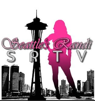
My First Logo

My Second Logo
I found a tutorial online that shows how to outline a picture using the pen tool and use it to create a silhouette so I used a photo from one of my previous photoshoots and used the pen tool with it set to no fill as I used the photo as a stencil for outlining. After scouring Dafont.com for hours I finally came across a font style that I’d like to use. Since I am majoring in Production, I decided to use a glamorous style font called Cheerful Party. After I added in my lettering, I used the elliptical tool and gaussian blur effect to create the light effect on my name. Afterwards I added in lines behind my name to give it more of a “Now playing” movie theater feel.
There actually wasn’t any open white space in my original photo but to make the photo look more realistic I used the pen tool with a while fill to create a small space in between the camera and my hands.
I would like to keep the space needle in my logo because it represents me and where i’m from so I will be adding it in on my final draft. I think I may also add in an extra shape to throw off the balance of the logo a bit. Just an idea.
-

Class Assignment Logo
Inspiration:


Here is my whiteboard sketch of my idea.. I couldn’t quite figure out what I wanted to do but I knew what picture I wanted to use.
Youtube link to tutorial Video: https://www.youtube.com/results?search_query=illustrator+silohuette+tutorial


You did an amazing job emphasizing your modeling experience, along with your photography background. Your first logo uses a lot of elements in Illustrator but it may be too much for a logo. To me it looks like an opening image to a TV show, if you were to have one! I love the second logo, its colorful and classy, which make it pop to the eyes of the viewer. You also included the Space Needle, which I think personally you need in your logo because you are Seattle’s Randi. For your last class assignment logo I can tell you used a good amount of elements on Illustrator. It is clean and fits your theme. I would recommend adding in the Space Needle somehow and also maybe taking the thin lines behind the font out, it’s a little distracting. Otherwise your logo is awesome for your first draft, and good job doing multiple logos.
Good luck on your Final Logo! 🙂